
Branding: New Audi's Typographic Style
As part of its week-long centennial celebration that included news about the upcoming release of the S5 Quattro — which might mean something to autophiles, but not much to me — Audi unveiled an updated logo that gave a new shine to the four interlocked rings, from a matte finish to a more chromalicious one, and it switched out the quirky wordmark for a new bespoke corporate typeface.
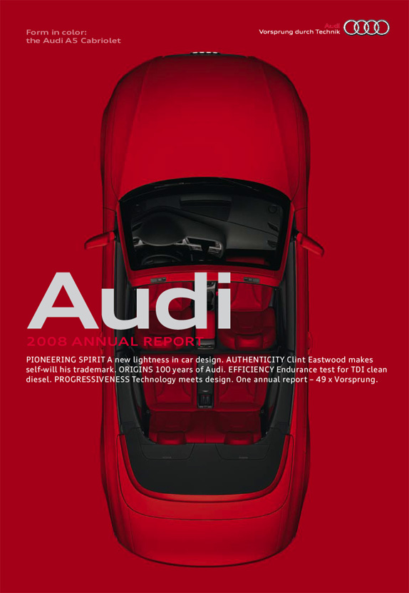
![]()
While I would have personally kept the old render of the rings, which look more sophisticated and subtle, I am probably one of the lonely souls to say good riddance to the old wordmark, which I have never liked. Neither letter works well with the other and there is no saving grace for that "d" unless someone were to tell me that it stands for a 6 or 9 and either of those numbers represent the number of pistons, or whatever other engine taxonomic detail, that made the first Audi run. But I doubt it. In exchange, the new Audi wordmark is set in the extended bold weight of Audi Type, a Roman and Extended type family commissioned by MetaDesign from Paul van der Laan and Pieter van Rosmalen. Along with being part of the new logo, Audi Type replaces Audi Sans, a modified version of Univers Extended.

The new type family can be seen in full action in the 2008 Annual Report, available as a PDF. The result is a strikingly modern and contemporary look that blends quite well with the Audi cars, slick and sophisticated. For a few more images and background, please visit FontFeed.
in Brand New


Nenhum comentário:
Postar um comentário