
Identidade: Carrefour Fades (to Color)
With more than 15,000 stores in 35 countries generating more than 100 billion Euros in sales, the French supermarket chain Carrefour is undeniably one of the world's most prominent retailers and purveyors of, to put it simply, good stuff at decent prices. Unflinching in its identity design, the icon and typography have remained consistent since 1966 — only nine years after Carrefour's launch — when the C-in-a-diamond icon made its appearance next to a typewriter-style wordmark. This September 4th, along with a new campaign titled "Positive is Back," Carrefour has introduced a new wordmark and a slightly modified icon.
![]()
Old (yellow) and new (blue) icon comparison overlay, 3 second interval.

Old (above) and new typography.
The Carrefour icon has never appealed to me. The resulting shapes from the C eating away at the diamond are unpleasant and create an odd pair of shapes. But, at this point, it is instantly recognizable so with such a high-stake operation around the world it makes no sense to introduce something revolutionary. This, of course, begs the question of why change at all, especially if the cost of implementing such a subtle change will likely be immense, but I imagine that as new stores open or old stores' signs fall down, the new icon and logo will be implemented and the immediate change will be apparent in banners, ads, coupons and in-store graphics.
The new wordmark is friendlier and quirkier, and has a nice flair to it that most serif typefaces lack, so it feels like a good birdge between the blocky slab serif of old and some corporate serif. The new icon is a little blander, it lost the sharp edges of the curls of the C and now it looks even more unpleasant.
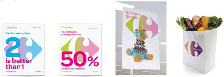
Sample applications. Image source.
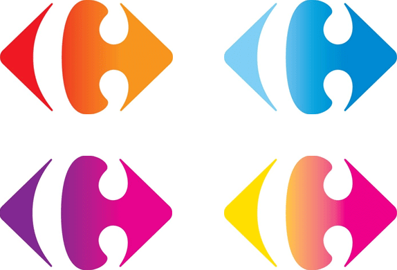
Four of many gradient combinations, more at Carrefour's Facebook page.
The biggest change, more than the icon or the typography, is the introduction of a range of gradients for the icon. In application — which, unfortunately, we only have one small image — the concept seems like it could work and gives Carrefour a slightly trendy and upbeat look. In isolation, there is something cheap about the look of the gradients. So, the jury is out for now pending some further executions. Overall, for a business of this size, any change is significant and something this playful is not to be easily dismissed.
New TV ads for "Positive is Back" campaign.
in Brand New


Nenhum comentário:
Postar um comentário